
The New York Times website was leading with charts of the Standard & Poor's 500 Stock Index "over the last year" and "the last week." If your investment time horizon is longer-term than that, you might want to take a look at this chart from J.P. Morgan Chase's quarterly guide to the markets:
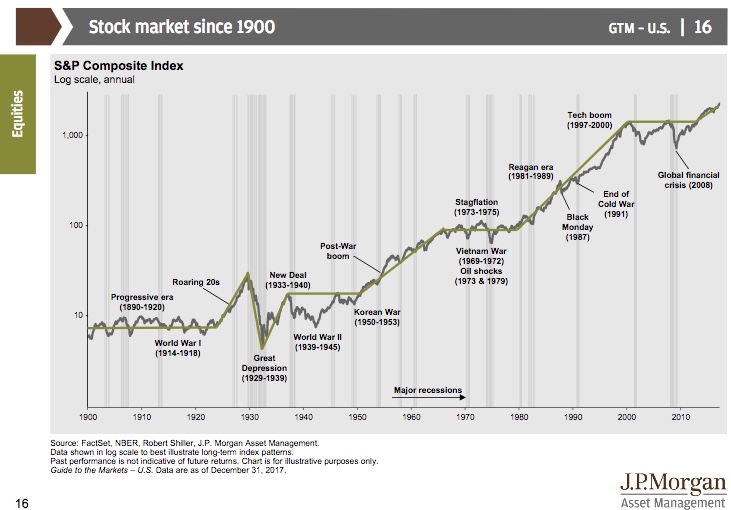
That chart, covering the stock market since 1900, includes two long booms, from roughly 1950 to 1970 and from roughly 1980 to 2000. You might even look at it as one long 1950 to 2000 boom, with a decade-long exception known as the 1970s. By comparison, the post-financial-crisis rally that some people say is getting old may be really just getting started. The long term trend has been up. That trend could always change, of course — "past performance is not indicative of future returns," it says at the bottom of the chart. But sometimes stepping back and looking at the longer term story helps provide some useful perspective.